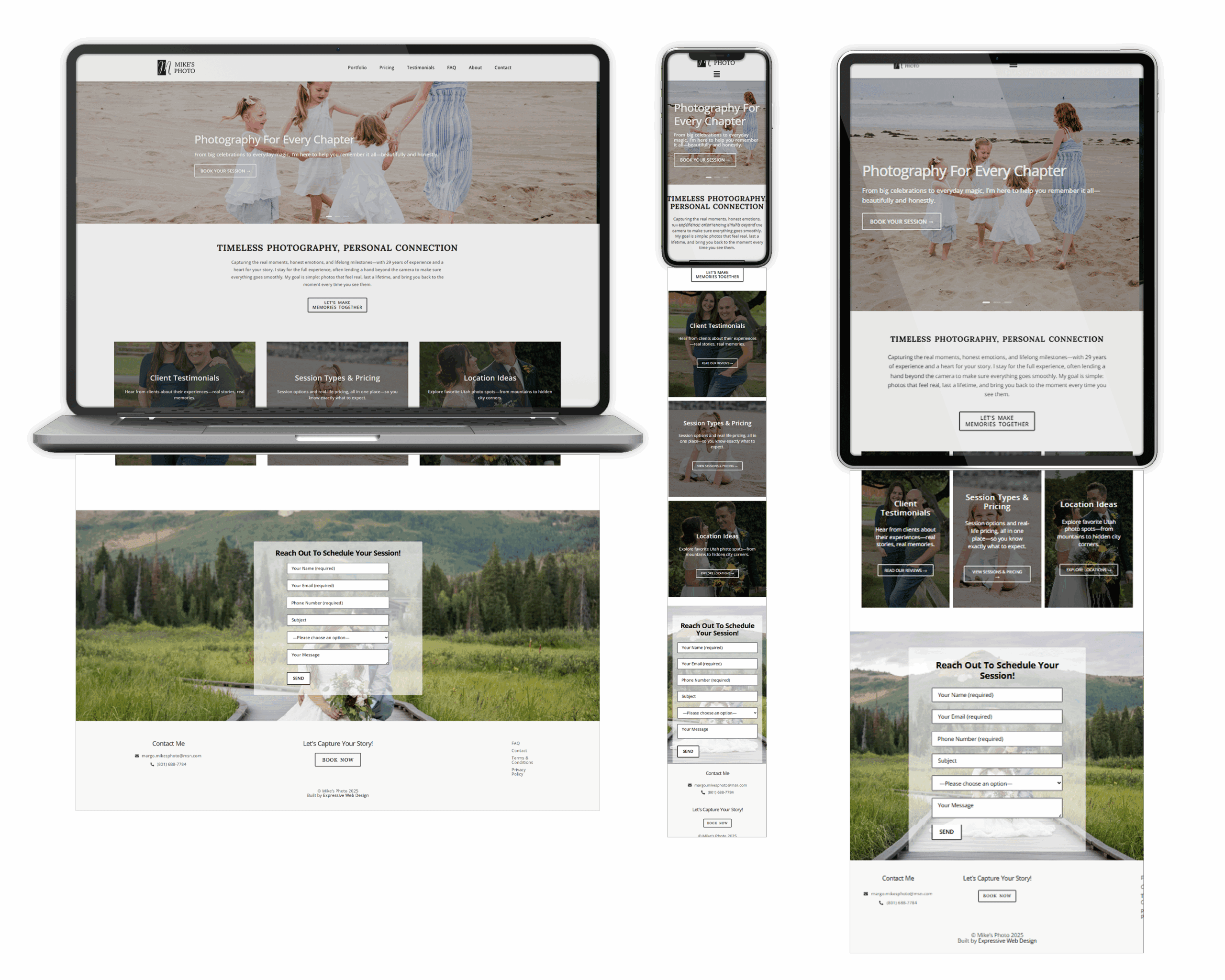
"Nicole is the best. My photography website needed a complete update, and she was up to the challenge. The first time I met with her, we talked about my expectations, my style, and my brand and then she got to work. Even though I was slow getting her some of the content she needed she finished the entire website in less than 2 months. I love the result. It is user-friendly, fun, and classy all at the same time. I would recommend Nicole and Expressive Web design to anyone in the market for a website."