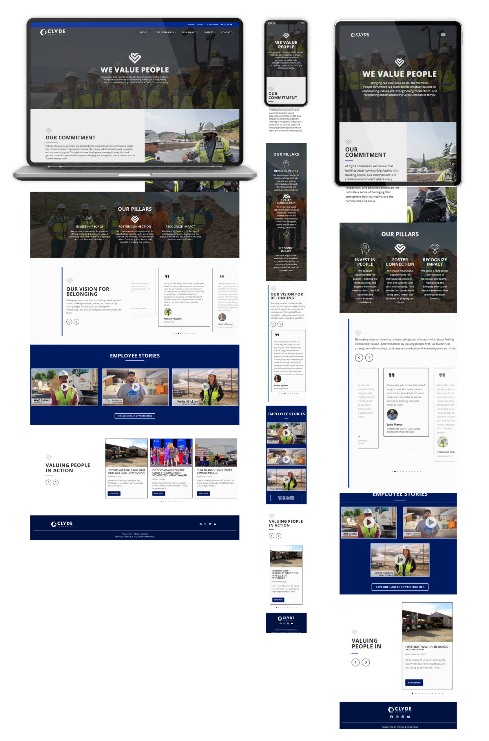
Expressive Web Design

clyde Companies

Website Redesign

Client Needs

Clyde Companies is a large parent brand with multiple operating companies, multiple audiences, and a lot of moving parts—so the website needed to function like a clear, organized hub, not a maze.

They needed:

  • A smarter structure that makes sense for a multi-brand organization (without overwhelming people)

  • Navigation that actually works when you have a lot of pages, departments, and priorities

  • Templates + consistency so internal teams can publish new content without the site turning into chaos

  • A modern, professional look that matches the scale and quality of the organization

  • A WordPress build that’s maintainable long-term (not fragile, not overly custom for no reason)

Solution

This project was all about clarity and scalability.

I worked inside WordPress + Elementor to rebuild key page layouts and systems so the site could grow with the company—while still being easy to update internally.

What I focused on:

  • Reworking the page structure so the organization and its companies are easier to understand at a glance

  • Creating a reusable design system (layout patterns, typography, spacing, components) so new pages stay on-brand

  • Building flexible Elementor templates that support real-world use: updates, additions, reshuffling priorities

  • Cleaning up UX friction (aka: fewer “where do I click?” moments)

  • Keeping everything grounded in SEO basics with a solid heading structure, scannable layouts, and clean page hierarchy

End result: a site that feels more like a well-run system, not a pile of pages.

Website Design

The visual direction needed to feel strong, modern, and trustworthy…but not flashy.

Construction/infrastructure brands win when the design communicates:
competence, organization, and scale.

Design choices included:

  • Clean, structured layouts that are easy to scan (especially for service + division content)

  • Bold typography + clear hierarchy so visitors can instantly “get it” without reading every word

  • A consistent component style (sections, cards, buttons, grids) to reduce visual noise across a large site

  • Intentional spacing and rhythm so pages feel high-end and calm—not cramped and chaotic

  • Mobile-first responsiveness so the experience holds up everywhere, not just on desktop

It’s the kind of design that doesn’t scream for attention—
it just makes the company look organized, established, and legit.

Client Testimonial